I read this blog (and Matt Allington, and Ken Puls) pretty religiously. But P3 Adaptive is probably my favorite because it deals with a lot of real-world situations, not just technical solutions. So, I’m going to continue that theme and talk about a different kind of problem-solving.
How many of you build reports for line-level or lower/middle management? Show of hands? Lots of you? Yep, that’s what I figured. And of those, how many of them care if the report has:
- Pretty visuals?
- Complicated analysis?
- Cool navigation buttons?
How many of them care about anything beyond “Can it show me, really quickly, the answer to one specific question? And can it give me all the data behind that when I need to export it out and work on it”?
The problem I run up against, usually, isn’t that I don’t know how to do what they need to be done. It’s that I can’t get enough detail about what they want to make it in the first place. Even when I can get an outline about what they want, once I make it we end up going back and forth. It turns out what they asked for isn’t what they needed, and they decide they’d be better off doing it manually like they have been. They’re resigned and frustrated and I’m annoyed that we can’t get a couple of relatively minor issues resolved. It’s a no-win scenario.
But…Here’s the thing about Power BI (or Power Pivot/DAX, though honestly these days I start in Power BI unless there’s a specific reason not to). It’s quick to do most kinds of basic analysis. I don’t mean that it takes half the time or a quarter of the time. I generally find that it takes a twentieth of the time compared to other solutions when you’re talking about things that are just slightly too complicated for regular Excel.
It’s fast enough, in fact, that you can build your analysis right in front of their eyes.
So instead of this flow:
- I get an email with some random CSV’s and a request.
- I take a look at it, figure out what kinds of questions I think I need to ask and schedule a meeting.
- Initial half hour meeting to figure out the base idea that ends with me thinking that I know what they want.
- Meeting breaks up, I build a draft and send it over.
- They go “oh, sorry, we need it like this.”
- I scratch my head, make my best bet as to what they need, and send another draft.
- Repeat steps 5-6 until we luck out and it works, or they give up, or I get reassigned.
- …Profit???
We get this:
- I get an email with some random CSV’s and a request.
- I pull the data into a reasonable-ish table structure and schedule a meeting.
- We have a meeting where they tell me what they’re looking for, and I put the analyses together on the fly and show them.
- During the half-hour meeting, we iterate rapidly through what they’re looking for.
- They leave the meeting with a working report
- Profit!!!
If you’re feeling lucky or tend to have people coming to you with data sources that are pretty clean, you can even skip steps 1 and 2 and do those during the meeting as well. Although in my experience, it’s a roll of the dice if the data integrity is that good.
You know, this sounds similar to the basic premise of agile BI that gets talked about a lot here. Where we get rid of the old clunky BI systems and do things with the Power suite instead? Except now we’re boiling that down even further, and instead of weeks, we’re talking one meeting. So how does this work in practice? Let’s talk through an example.
A manager sends me over an Excel sheet and is trying to figure out what percentage of the shipments in a given period were for different types of scenarios. But it’s more complicated than that because some of the shipments need to be weighted more heavily than others, he needs to exclude a particular sub-type, and there’s some bad data in the sheet that needs to get cleaned up. The problem is that this is going to need to be done pretty frequently going forward, the data we have access to can’t be cleaned up at the source, and he doesn’t want to do it manually each time.
Sounds like something we can do!
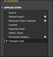
I pull in the data within five minutes of reading the email. I’m not going to go through it all, because everything in here is just button clicking in the Query Editor:
The only thing I had to do manually was to fix the automatic type assignment for our reference numbers (Power BI always wants them to be numbers rather than text, but that’s a small price to pay for auto-detect).
I shoot out a meeting invite for later that day, and the manager accepts.
I continue with my day, and when it’s time for the meeting, pull up a blank canvas and ask him to describe what he’s looking for. He’s trying to show a higher up manager while they’ve been assuming X% of the shipments are Type 2, that’s changed since the last time this was looked at a few years ago. Not all shipments are equal, some of them have to go through a more labor-intensive process. He’s gotten a tentative agreement that this takes three times as long as regular shipments.
Easy enough, let’s get that shipment weighting figured out, two measures:
- [Shipments] =
DISTINCTCOUNT ( ‘Data'[Shipment Reference] ) Simple distinct count on reference number, since we can potentially have shipments in the data set a few times. - [Shipments with extra labor factored in] =
CALCULATE ( [Shipments], ‘Data'[PROCESS_2_CHECK] <> BLANK () )
* 3
+ CALCULATE ( [Shipments], ‘Data'[PROCESS_2_CHECK] = BLANK () )
Two CALCULATE’s, one where we did the more labor-intensive process, so we multiply the count by 3, and then the regular count if we didn’t do the more labor-intensive process. Yes, it would be cleaner to do this as two different measures and then add them together, but putting this together was what came to mind at the moment, and it worked.
Once I have those measures, I quickly slap two visuals together, one with the percentage, and one showing the comparison between the straight up and modified numbers for a reality check. We expect that almost all of the more labor-intensive shipments will be Type 1, and when we look:
That holds up! And the percentage is in line with where the manager had been thinking, so that’s good too.
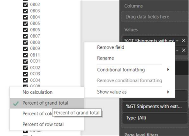
Note – Don’t forget your “Show value as”! We’re used to it in pivot tables, but Power BI can do it too!
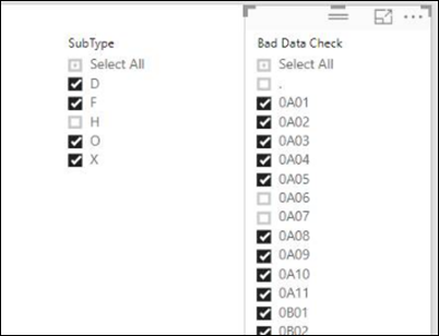
Next thing: There’s some data we need to exclude. Shipments that have a dedicated person working on them (and thus don’t impact our allocation calculations). So, I add in two filter visuals:
The SubType filter gets rid of the shipments being handled by the dedicated person, and after a couple of minutes of discussion we decide that the bad data is too difficult to describe systematically (what’s “bad” changes every month,” so with the second filter he can uncheck boxes. This works much better than actual exclusion rules. Could we have figured something out? Probably, but it takes him less than a minute to filter manually, and it was going to take longer than we had to figure it out, so this was a good compromise.
We look at the final numbers, and he’s really happy as they match up pretty well with his projections. He’s delighted, the only thing he needs is to be able to export out the underlying data to do a reality check later. The problem is, these particular visuals don’t allow that natively. In all honesty, I’m never sure what visuals under what circumstances let you expose the underlying data. But thankfully, I don’t have to care!
What is this, you ask? It’s a table. I put a Table visual out, added all the columns that they might need to see to it, shrunk it down, added a title called “Export Data,” and showed him how he could click the three dots and export out his data. That’s everything he needed, so now the report is done!
Twenty-two minutes into the meeting, we agreed that we were good to go and signed off. Counting the five minutes it took me to pull the data into Power BI in the first place, that leaves us at less than half an hour spent to get a working, usable report together. Is it pretty? Nope. Does it get the job done? Hell yes!
I’ve done a bunch of reports this way now, and my favorite reaction was when some managers asked me to do something, then moved on to another topic as they assumed I’d have it ready for the next meeting in a month. By the time they paused their discussion on the next point (less than five minutes later) I’d rejiggered the visuals and added in a new calculation they wanted. They all stopped for a minute, and the senior manager went “Wow. And that’s why we have you in these meetings.” Not too long afterward, he started including me in essential discussions as a matter of course, because he felt that more got done and that the meetings ended faster when I was in them.
When was the last time you heard someone say that about the guy who builds reports?
Where It’s At: The Intersection of Biz, Human, and Tech*
We “give away” business-value-creating and escape-the-box-inspiring content like this article in part to show you that we’re not your average “tools” consulting firm. We’re sharp on the toolset for sure, but also on what makes businesses AND human beings “go.”
In three days’ time imagine what we can do for your bottom line. You should seriously consider finding out 🙂
* – unless, of course, you have two turntables and a microphone. We hear a lot of things are also located there.


